
As we all are aware, World today is so closely connected that distant geographies aren’t any hurdles for business opportunities. The immense modernization and technical developments happening at a very fast pace in Internet access methodologies as well as the types of access devices.
Today, every person on the planet can be your possible customer & by means Internet, Businesses are becoming Online to serve the needs of the Customers and also reaching out to new market places for Business Opportunities.
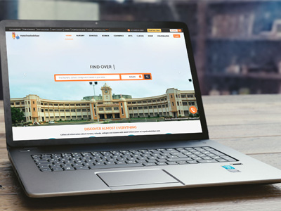
Websites & Online Portals are the two strong modes of Communication & Interactions. However, due to changing face of the technology, to match the pace with the changes happening around the Industry, making a Responsive Website that is easily accessible on your Smart Phones & Tablets is the need of the hour.

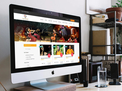
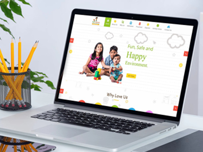
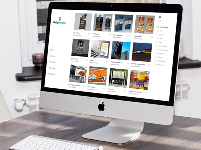
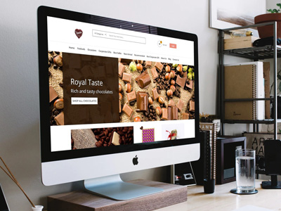
From last more than 9 years, Oyster Technology successfully designed & delivered the more than 500 Websites adhering to the requirements of our Customers.
To explain in short, Responsive Web Design (RWD) is an approach of laying-out and coding a website such that the website provides an optimal viewing experience — ease of reading and navigation with a minimum of resizing, panning, and scrolling — across a wide range of devices (from desktop computer monitors to mobile phones, tablets). Our designer creating a Responsive Design ensures that the website’s navigation elements, screen-layouts, text, images, audio/video players and other UI elements re-adjust themselves on a variety of devices. Thus, it saves majorly on extra time and money in creating and maintaining one “mobile-site version” and another “desktop-site version” of the Responsive website.
At Oyster Technology, we are experts in Web Development. We create & customize a responsive website that responds according to the user’s device behavior and environment. When a user, shifts from laptop to his smartphone, the website automatically transforms itself to accommodate the resolution, image size and scripting abilities that best fit the display device to give the best showcasing results.
One of the distinguishing facilities that we offer to our Responsive web designs is – Search Engine Optimization (SEO) enabled. Its recommended by Google.com, world’s highly preferred Internet Search Engine, that having an SEO Enabled Responsive website surely boosts up the ‘Appearance Ranking’ of the website in ‘Online Search Results’. And our designs empower your website to appear at leading positions in such Online Search Results, helps your website to have improved number of visits by your Customers.
To add, technical experts & developers at Oyster have hands-on experience to use a mix of flexible grids and layouts, images and make smart use of CSS.
For all your Responsive Website Designing related requirements, Oyster Technology is a trustworthy solution, as we help you provide your customers best of the services.
©2007-2024 Oyster Technology - All Rights Reserved